
At Ranch House Designs we work with clients from a wide range of industries, on projects ranging from a simple business card, all the way to an advanced WordPress website. We love the variety of our day to day work, but there are some things that will always stay the same… our designer pet peeves!
Don’t worry, if you are guilty of any of these, that’s 100% OK! Graphic design is all about personal expression, these are just some opinions from our team. Enjoy!
10. Comic Sans MS
 I know you’ve heard this one before, but this is my number one pet peeve. I’m talking, I see it on a flyer or even worse, USED AS A DENTIST’S OFFICE SIGN IN A BUSY, CROWDED STRIP CENTER, and I start breaking out in a cold sweat and getting a weird rash. That’s how much I HATE THIS FONT. I just don’t get why ANYONE would ever, in their right mind, be browsing for a font to use, see Comic Sans, and think to themselves, “This is exactly the look I’m going for!” If that look is disgusting, terrible, I-want-to-poke-my-eye-balls-out, then go for it! I. Can’t. – Halle
9. Bad Leading
 Designers can’t stand it when there isn’t enough space between lines of text. The worst is when ascenders and descenders on letters overlap between lines of text making a paragraph look sloppy and hard to read. As a good rule of thumb, the leading should typically be at least 2 point sizes larger then the point size of the text you use. So if you use 14 pt text, then the leading between lines of text should be at least 16 pt. – Sarah
8. Font PANDEMONIUM!
 Infographic/typography design is a popular style to display a quote, headline, etc. You don’t have to browse Pinterest for very long to find an inspirational quote in a whole slew of fonts. BUT, the general rule of thumb is 2 fonts, with a third being added if it’s a classic text font (sans/serif fonts). Rarely I have seen more than 2-3 fonts paired together that didn’t end up looking like a hot mess. It’s a fine line, so be careful! – Halle
7. Orphans
 An orphan is a single word at the bottom of a paragraph that gets left behind. Not only does that one little word look very lonely all by itself, but it actually interrupts the reading process. The single word on a line by itself has extra what space around which unintentionally draws the reader’s attention to it. As graphic designers, we adjust the lines of text or the spacing between words and letters to avoid orphans as the final step in the design process. – Sarah
6. Curlz MT

This is the kooky cousin of Comic Sans MS… the one who gets crazy at family reunions and dances on the table and is drunk by 9:30 in the morning. Thinking of using this font? Contribute a little bit of goodness to humanity and pick another font (as long as it’s not Comic Sans MS). – Halle
5. When clients are vague with design instruction or feedback
 Each and every person has a unique view and unique reference point for the descriptive words they use. We create these definitions based on our individual experiences. For example, when I describe something as vintage I may conjure up mental images of Elvis, juke boxes, and beehives. When someone else describes something as vintage they may think of old-timey mustaches and flapper dresses. So the more specific a client can be with instructions the better! Don’t just say you want a vintage design – instead describe what vintage means to you, what you like, and even what you don’t like. After all, designers aren’t minder readers! (Well, we can’t speak on behalf of all designers…) Just remember, the design process is actually a collaborative effort between the designer and the client. The client’s role is to provide as much information as possible so that the designer can provide the appropriate solutions. – Sarah
4. Beveled Text

1995 called…. they want their beveler back. #ThatIsAll. – Halle
3. The Mysterious Floating Text/Graphic/etc.
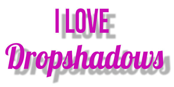
Dropshadowing is a great tool and can be used really effectively. But when your image starts to look like it’s floating, rather than having a natural shadow, it’s time to take your finger off of the mouse and step away. I’m not saying never dropshadow ever, because I definitely drop shadow like nobody’s business, but just keep it to a eye-appealing minimum! – Halle
2. Any sentence that starts with “My designer friend said…’ or “My Mom said” or “My Sister said’
Hey we get it – you like to get feedback from your friends and family. That being said, you didn’t hire your designer friend, mom, or sister to design for you. You hired your designer or marketing agency because they are the experts; they have the design experience, and they have the industry knowledge to guide you in the right direction. At the end of the day, you have to remember that everyone has different tastes and you just can’t please everyone. The most important thing is that the design solution effectively communicates to your potential customers (aka your ‘target audience’). So trust your intuition and your designer’s guidance. – Sarah
1. White Space Is Your FRIEND!
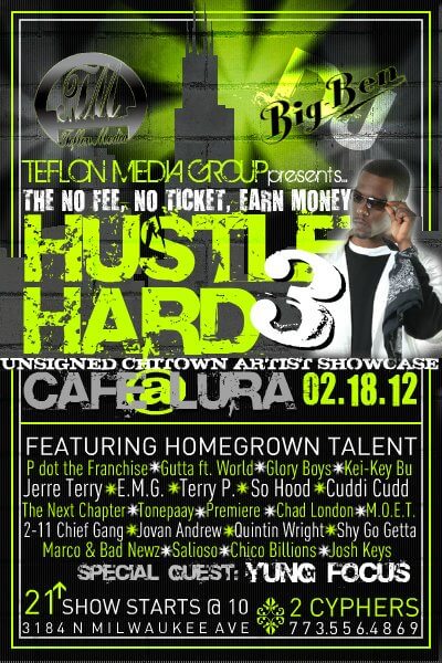
One of the things I can’t stand is when an ad has included SO MUCH INFORMATION that your eye has no idea where to even begin looking. I always find it challenging to juggle the integrity of your design when the client wants to start adding a dictionary to their ad. I’m a huge fan of the simple, minimalist style ad: A strong, bold headline with a powerful image and straight, to-the-point text. When you start adding photos and texts and shapes and colors and stars and glitter….. you get my point. Things get crazy! Remember that white space is your friend 🙂 – Halle
Ready to get started?
Whether you need a flyer or a full website designed, the Ranch House Designs team is here to help! When you work with Ranch House Designs, you get the strengths of a large-scale advertising and graphic design agency, combined with the personal attention that come from a small firm who knows and cares for each client. Ranch House Designs has raised the bar with our creative graphic design and marketing solutions, and we invite you to contact us and learn more about how we can help your business grow and succeed.
Oops! We could not locate your form.